Snap map.
06 June 201410:11AMthings
So this is going to be another post that's slightly off the technical deep end. Sorry.
There's an interesting little feature in Snapchat - or at least, in the slightly unofficial version, called Best Friends. It looks sort of like this:
I think (though you can never be sure with this kind of stuff, and I haven't really done any proper experimenting) that which contacts appear in this list is based pretty much entirely on who you send the most stuff to.
(Let's just skim over the social commentary of calling someone your best friend just because you send them a lot of selfies and move on to the interesting bit, okay?)
The interesting bit is this: You don't just see your own list. You can see other people's as well. This is a really fascinating bit of data to expose, and an interesting choice by the developers, assuming that it is actually an official feature. If you added this kind of thing on, say, Facebook, it would probably cause all kinds of shitstorms. In Snapchat though, I guess it kind of works. Probably because the kind of communication that happens on Snapchat is so trivial, or more importantly, has the reputation of being trivial, that it slips from being contentious to just being interesting. Or more likely, ignored.
One of the crucial parts of social network theory is being able to characterise the strength and nature of the relationship - and actually being able to then lay all those relationships out to see how they... you know, relate. Oddly, on most social networking platforms, this is actually hard to do without doing some difficult database scraping. And more oddly, I'd hesitate to call Snapchat a social networking service at all - yet it's the clearest expression of real social network theory I've seen in a so-called social networking site. Which is probably more to do with shifting terminology, now that I think about it.
Anyway, there are some interesting patterns there, and interesting patterns make for pretty cool graphs.
The way we're going to do this is with Inkscape. This is because I really really like Inkscape, and I already know how to use it. Unfortunately, it's just about the worst tool for the job. Inkscape has a rudimentary node and connector tool which is really only barely a layer over the lines and shapes tools, and it's just barely there enough to make it worth trying, but probably not quite there enough to actually make the job any easier. So while the end result will undoubtedly be pretty, I'll probably tear most of my hair out trying to do it.
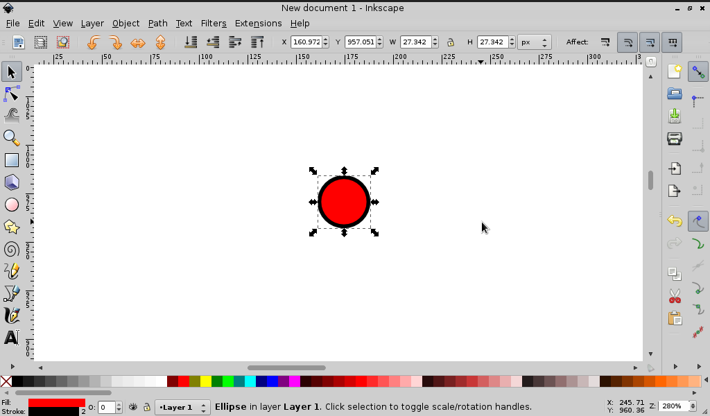
So, let's start out with a circle.
And a few more. If I change the sizes and colours of the lines I get this cool stacking effect.
Hey, this isn't so bad.
Oh god why has everything come unplugged?
Okay, this might need a little bit more of my attention. I'm going to make some drawings, do some planning, and report back here when I'm done.
...45 minutes later...
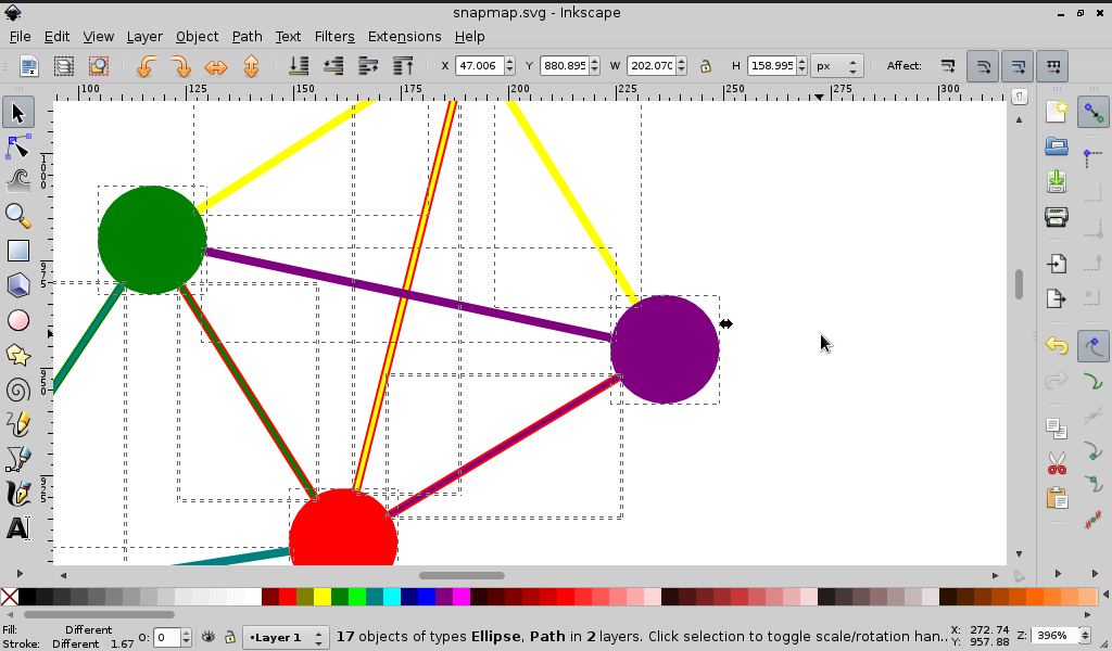
Alright, so here's what I've come up with.
Outgoing friendships (ie - the people on a given person's list) are indicated by a solid line, of the person's colour. A dotted line indicates that the endpoint for that relationship is outside the rest of the network - in other words, I don't recognise their username and therefore don't recognise their very existence. So in this case, Yellow sends stuff to Red a lot, and Red sends stuff to... some mysterious other person a lot.
I ditched the stacking effect for reciprocal friendships because it made the colours messy and I couldn't decide whose line belonged on top and it really seemed to confuse the auto-arrange algorithm which I don't know why I'm still bothering with. So I went with parallel lines instead. So in this case, not only does Red snap Yellow a lot, but Yellow also snaps Red a lot. This is not something that the app is actually aware of, which I guess means that we've discovered something new already?

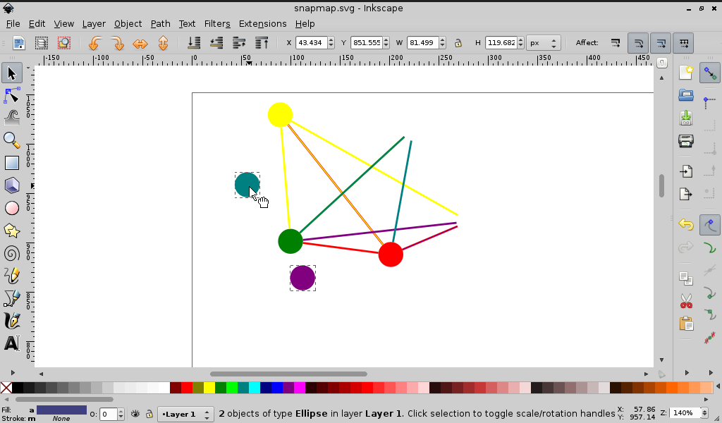
Finally, as a bit of a sanity check, you can pretty easily count the number of lines for a given colour. This way, there should be exactly three of each. So after a bunch of tedious mucking about with layouts, here it is:

There are a couple of things that immediately jump out at me:
- In a vindication of the power of human instinct over computer algorithms, this is pleasingly similar to the scratch copy I made in a notebook before starting.
- It pretty obviously only indicates who's sending more pictures to each other, rather than the strength of relationships. There's probably a correlation between the two, but it's not necessarily a strong one.
- It's wrong. The information is correct as of last night, when I put pen to paper, but apparently only a couple of hours of active use is enough to change who your 'best friend' is. The algorithm here may be more complex than it appears - maybe with a weighting for recency? Or some kind of kickback for viewing/replying? Hmm.
- Because of 3, this would actually make a really neat app. Unfortunately, since Snapchat doesn't actually have a public API, you can't publish anything that plugs into snapchat on any stores. Which is dumb. Also, writing what's basically graphing software would likely be pretty hard.
- It's hard not to start reading things into this once it's in this form, even though exactly the same information gets ignored regularly in-app. I chalk this one up to the fact that humans are just better at understanding and personifying complex relationships when they're displayed visually. Or as I like to call it, 'the pretty colours hypothesis.' (Poor Purple. You have so much to give, but everyone keeps ignoring you.)
- Because of 5, I've anonymised it. Because nobody wants to find out that they're that pink weirdo in the corner who doesn't talk to anyone. And on the graph!
- It would look way cooler in 3D. Maybe as a ball-and-stick model with a nice pair of 3D glasses and gloves to manipulate it in the air in front of you.
So what kind of social network are we?
The archetypal binary, at least as I learned it in sociolinguistics, is between 'rural towns' and 'cities'. Rural towns have ties that are strong (like, friends and family, who you have direct contact with), multiplex (as in, more than one relationship exists - like your neighbour may also be your teacher), and dense (that share lots of links in common), whereas cities have ties that are weak (acquaintances, who you may not even have direct contact with, like your newspaper delivery van driver), uniplex (one role per relationship - like your newspaper delivery van driver) and loose (so, not very interconnected at all.
I think it's obvious which one of these is a better fit for us. Basically, we're a bunch of country bumpkins.
Here's the interesting part though - strong, dense networks tend to reinforce norms. The more tightly bound to the community you are, the more linguistically conservative you tend to be. So you'd expect orange to be the last one to pick up some new-fangled expression. New stuff tends to come from those less tied to the community, or with links to other communities (like green and blue).
Maybe using this to map actual relationships isn't the best idea. Maybe the right use for this data is to track the evolution of the linguistic-ish content of snapchats. That is, if they didn't have an annoying habit of disappearing before you could properly study them.
Which would still be fascinating to compare to reality, if I hadn't anonymised it so you have no idea who any of these colours are. You'll just have to use your imagination, I guess.
< Who killed the desktop metaphor? Braindump 2: Sandwiches >